
objective
Bringing stories to life for a youth theatre in Warsaw
details
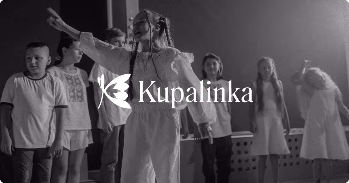
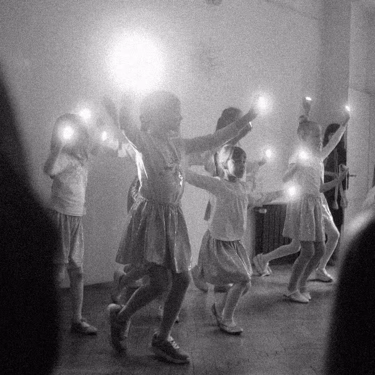
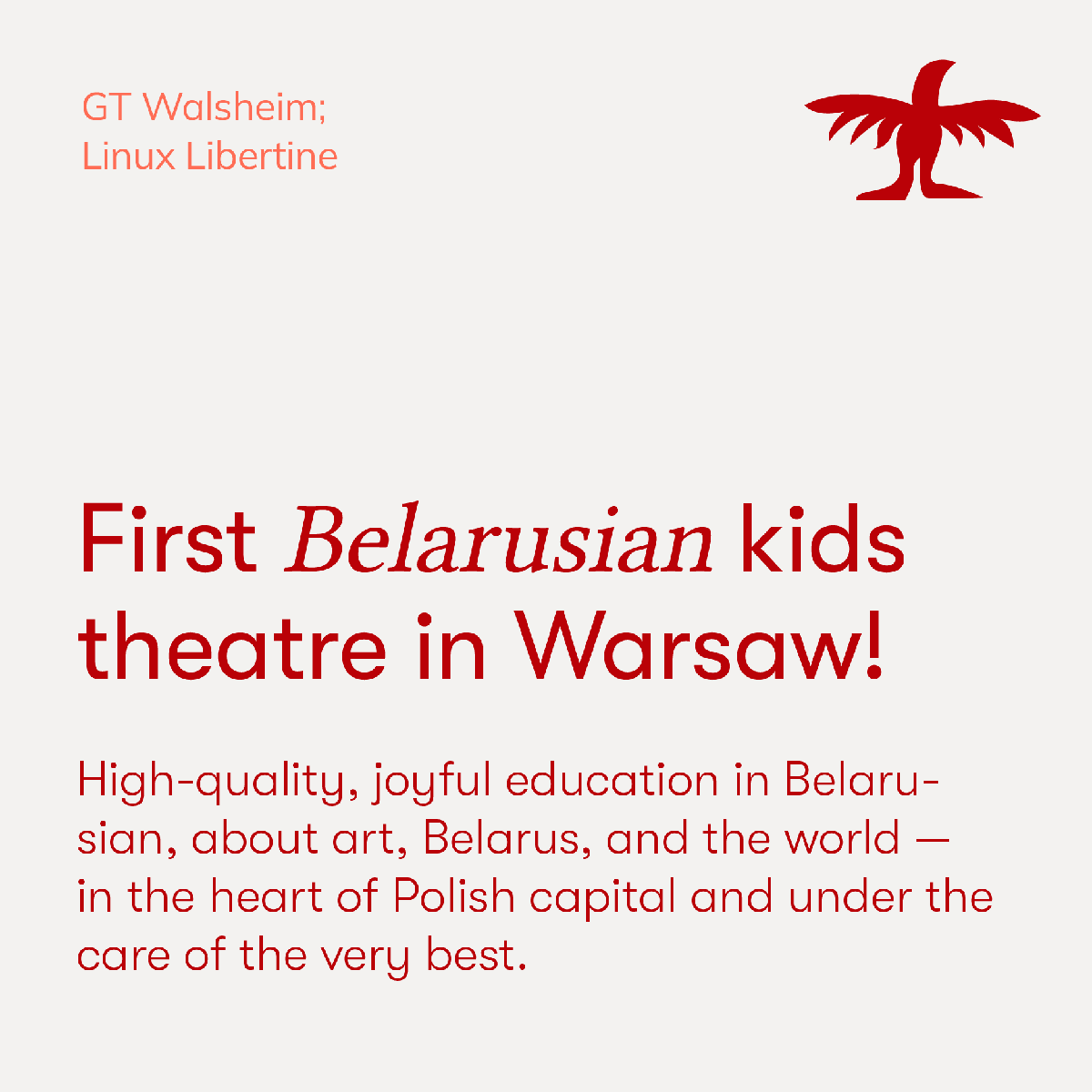
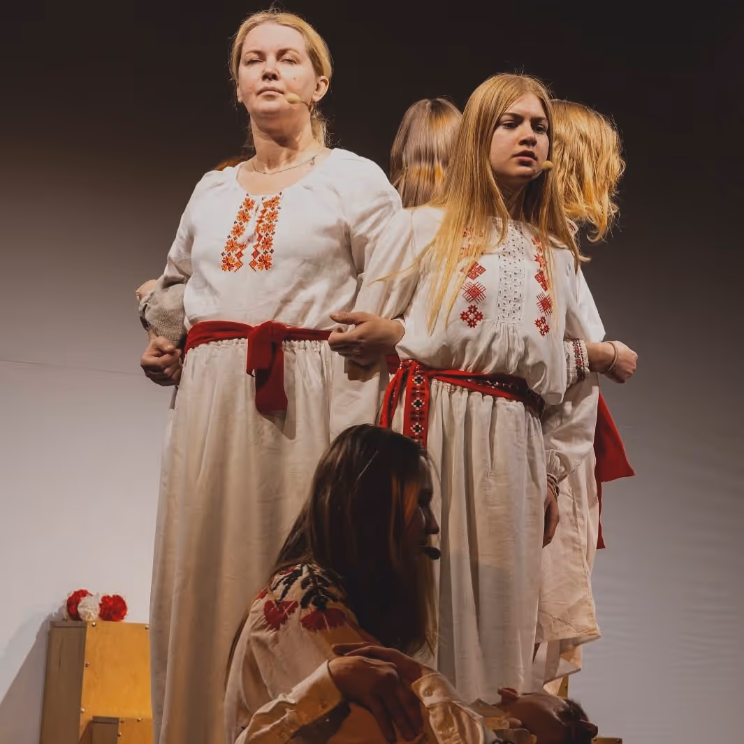
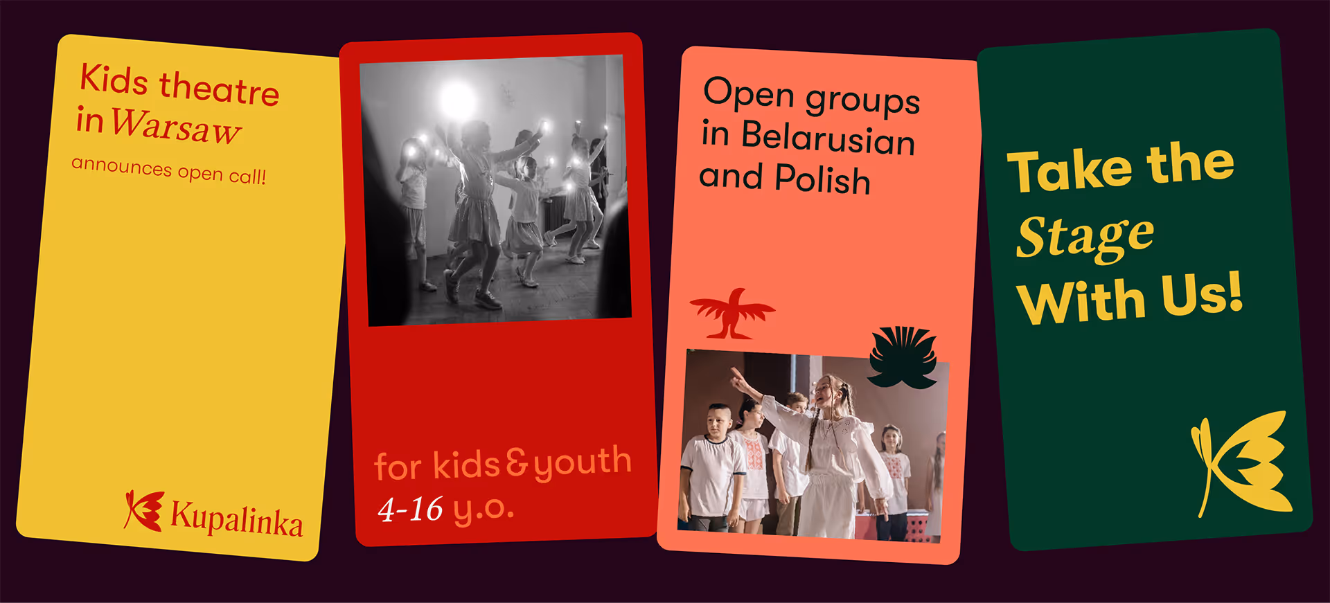
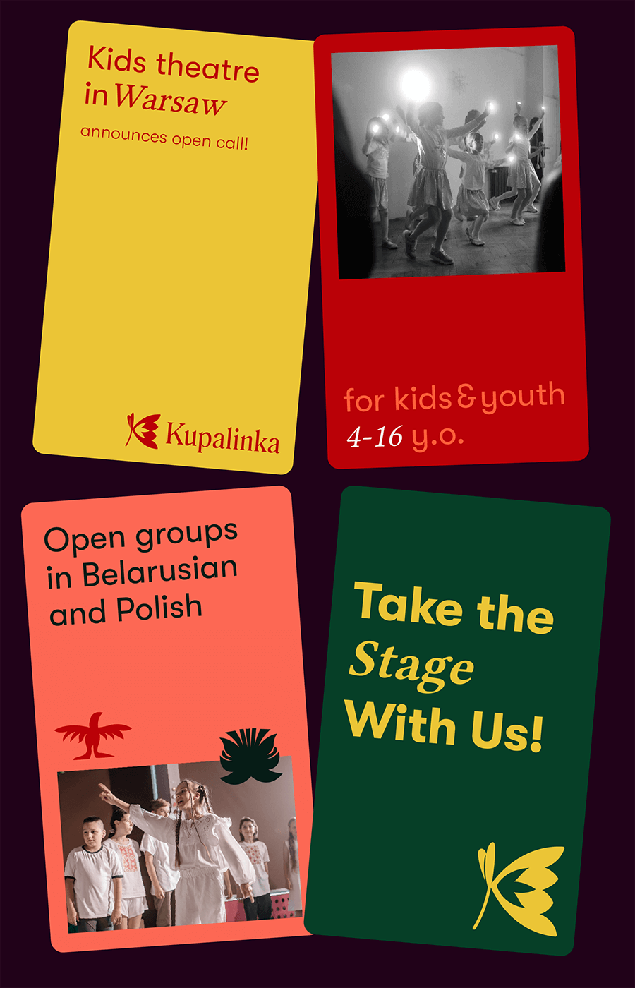
"Kupalinka" (which is a name of Belarusian folk song) – is a new youth theatre founded by Belarusians for expat community living in Warsaw. After quiet existing since 2020, they wanted to become more visible and build recognisable brand.
LOGO DESIGN
BRAND ACTIVATION
BRANDBOOK
SOCIAL MEDIA
the purpose
The theatre organises events and invites people of all ages, but the target audience of their brand would be parents and potential investors who donates to cultural projects like this. That's why we decided to keep classy feel and make the identity easy to use, since there's no designers on board.
.png)

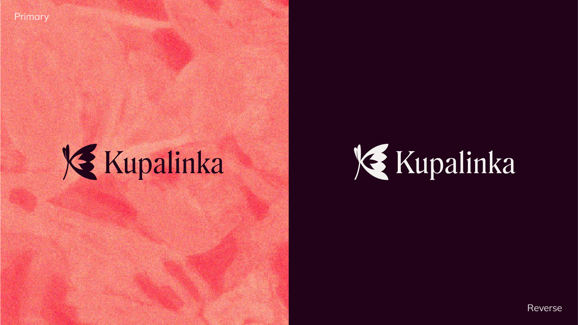
LOGO
Logo takes it's inspiration in Belarusian "wycinanka" – which is basically a paper cut-out – and flowers that are the symbol of folk holiday "Kupalle". The symbol creates letter K in its form.
LOGO
Logo takes it's inspiration in Belarusian "wycinanka" – which is basically a paper cut-out – and flowers that are the symbol of folk holiday "Kupalle". The symbol creates letter K in its form.
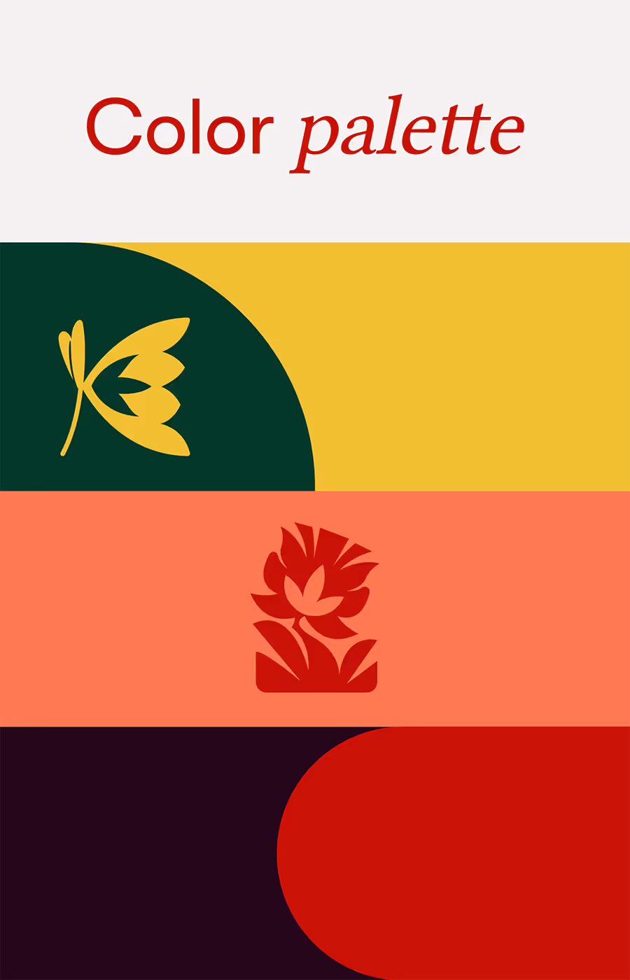
Color palette is versatile – it can easily go in fun&bold direction as well as calm and classy, which is great for adopting for versatile materials for kids and adults targeted materials.

Olga, Coordinator
Each of the options makes us want to keep and have it, and the choice is tormenting us. We bow at your feet for your talent — the entire Kupalinka team does!
